Mindfulness is often talked about in relation to serious topics like mental health, nutrition and career choices but did you know that being mindful can be a useful tool for things like home décor?
Most of us try to decorate with things we love and colors we like but sometimes that may be tricky to identify. Learning to pay attention to what we are attracted to in different areas and staying curious can help uncover elements of our style and get creative with choices that truly reflect our personal taste.
When asked what my favorite color was, for years I would say, “blue.” I used to think: red is too flashy, nobody likes orange or green, I’m pretty sure I don’t love yellow…so blue it was. I mean blue is nice but was it my favorite? And why exactly did I like it?
I started questioning this choice after a boy asked me that same question a few years ago and when I stopped to think about it, proceeded to say, “I don’t have one.” This was unacceptable for a child – “everyone has a favorite color,” he said. He wasn’t wrong but I was done saying blue for the sake of saying blue…so I started paying more attention to my surroundings and what I was drawn to in order to be prepared the next time this critical question came around.
I soon recognized a pattern of positive feelings emerging when I saw green. The crisp look of grass when I walked through a park in the Spring energized me, I loved how I felt when I looked up at the trees from the hammock in my backyard during Summer. The mountain bike in my garage I suddenly recalled selecting because of the bright green paint stripe on the dark gray frame (performance clearly came second).
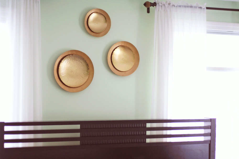
With this new insight I started to re-decorate some of the rooms in my home. My home office got a dose of happy with accent pieces in bright green tones and next up was painting the guest room. I didn’t want anything that would turn guests off but still wanted it to reflect my personal taste.
Narrowing down a green wasn’t difficult (the final choice is on the right) but I was stuck on the palette for the rest of the room.
I could have gone with neutrals or pastels but that felt too much like a spa theme which was not the look I was going for. This is one of the brightest rooms in the house – it’s a happy room and it called for something different.
For weeks I did nothing with it – not knowing what direction to go in and then my friend posted a photo of what she was about to eat:

I wasn’t big on avocado back then, nonetheless, her lunch of vibrant greens and bright red peppers looked so pretty!
Red is one of my least favorite hues but by combining the bold color with a pale green and perhaps a gold metallic, I knew this salad inspired palette would create the fresh and energetic vibe I was going for.
When I wasn’t trying so hard and simply noticed my reaction to a photo, I was able to use that information to update our guest room with décor that I’m really happy with.
 Crown molding and a wider baseboard was later added:
A little back story on the purple room:
When we moved into our house, what we ended up using as a guest room was lavender (as seen in the ‘before’ pic). The previous owner’s teenage daughter painted it along with flowers and inspirational quotes on the walls.
Part of me was sad to cover it up because it reminded me of the years when my sister and I would pretend to be interior decorators and change things up in our shared room to meet our personal tastes as we grew up. Sometimes this meant paint, often it was just new comforters or curtains and one time my sister even made a DIY headboard (this was before online tutorials, Instagram and Pinterest) for our bed.
While I went ahead with the color change I discovered these painted flowers on the window sill and decided to keep them there to celebrate that creative spirit. Hope you feel that spirit and a little sunshine today.
I believe it’s important to make a home comfortable for you and your family’s needs. It makes me sad when I visit someone and they say something like, “that’s our formal living area but we NEVER use it, I wish it was an office (or playroom, study, etc).“ If you don’t have use for a space as it was presented to you when you purchased a house or in its current layout, don’t be afraid to change it.
For this reason I have converted our dining room into an office and creative studio space. Don’t get me wrong, I love a private dining area and one day that’s what the room pictured below will be. For now, when week-night dinners at our house are consumed in front of the television and guests inevitably gather around the kitchen island, I am happy to use the room in a way that makes sense for me today.
Here’s a peek at a section of the room I will begin to use as my home office:
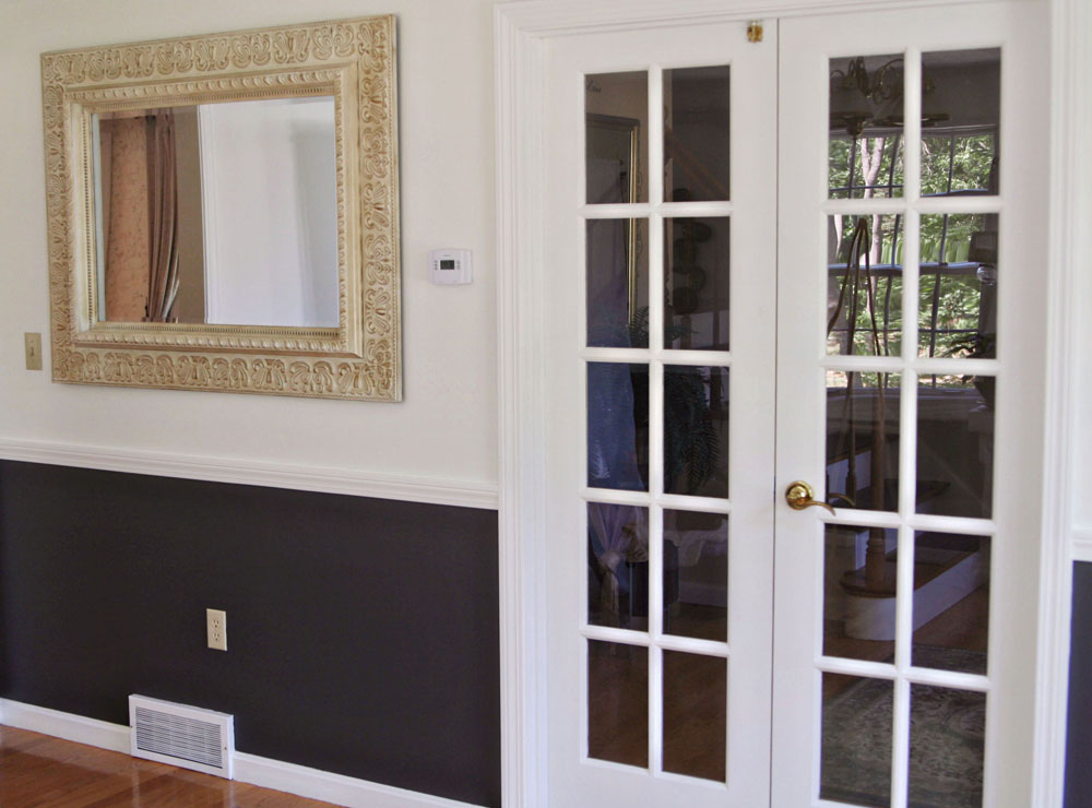
Before and After (alternate views)
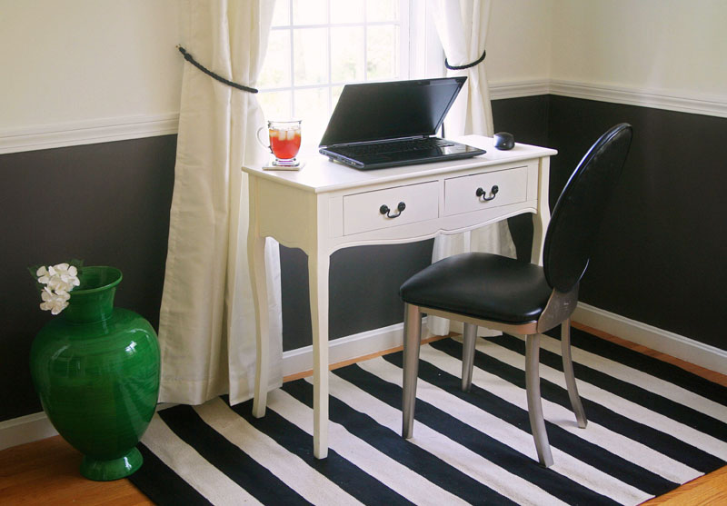
The room was originally painted in butter cream-like tones (a bit darker than what the photos reveal). I decided to change it for something that would allow bright artwork and colorful accents to really stand out.
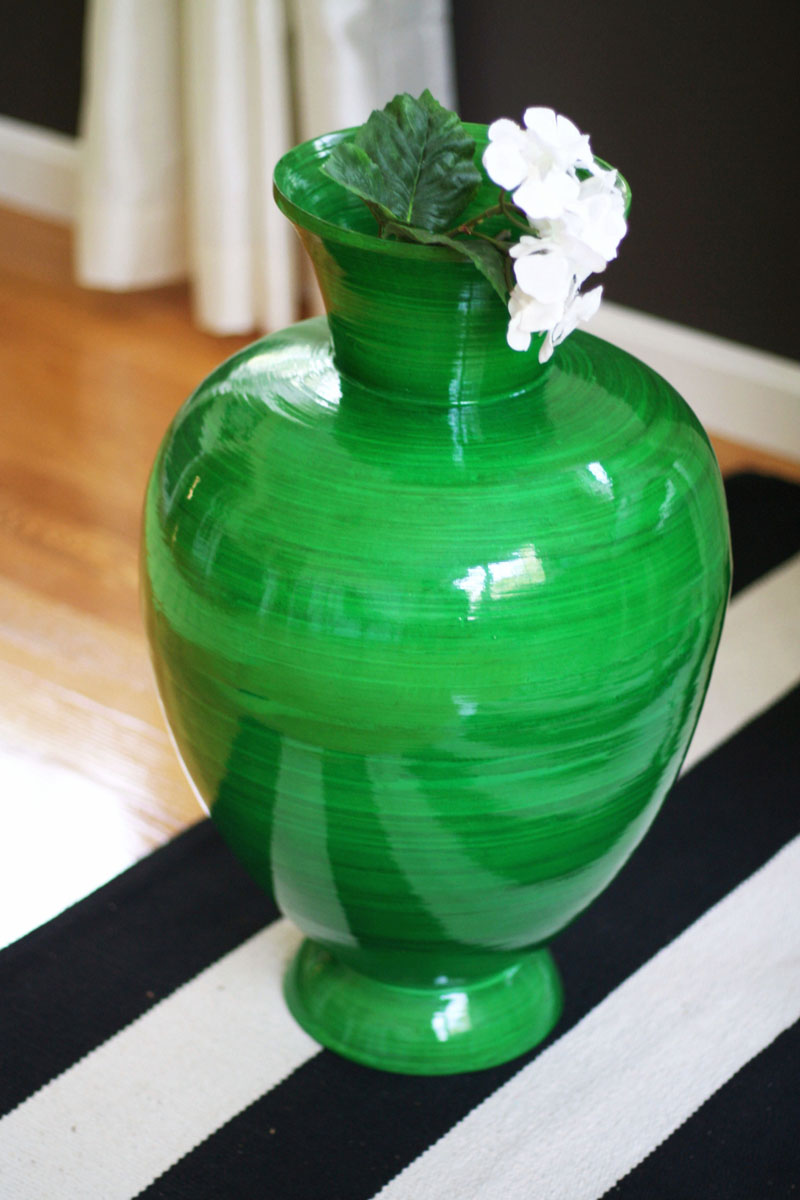
I almost chickened out on the selection of white – would it look too plain, too boring? By selecting varying paint sheens (semi-gloss white for trim and matte white for the walls), it is anything but. The walls beneath the chair rail are painted in a satin finish (Benjamin Moore’s Iron Mountain Gray) and I absolutely love the result.